Conversational apps (voice skills, chatbots) pose unique challenges to the teams creating and maintaining them. The nature of natural language-driven conversations makes each piece of content (the app's prompts and responses) both tiny and hard-to-understand-in-context compared to screen-based design.
Teams need effective and efficient support across the lifecycle of creating and maintaining conversational apps, but end up cobbling together spreadsheets, flowcharts, code, and other poorly-integrated or ill-fitting tools, resulting in reduced productivity and, ultimately, disappointing outcomes.
As the UX lead (and sole designer) at this early startup, I worked extensively with users, CEO, CTO and developers to create a better experience for conversational developers and designers, starting from an inherited product with many constraints.
Out of all my work on the product, website and communications, perhaps the biggest challenge was designing the "Scenes" feature described here.
I interviewed conversational design teams about their process and struggles, which showed an opportunity for better supporting the design/development workflow.
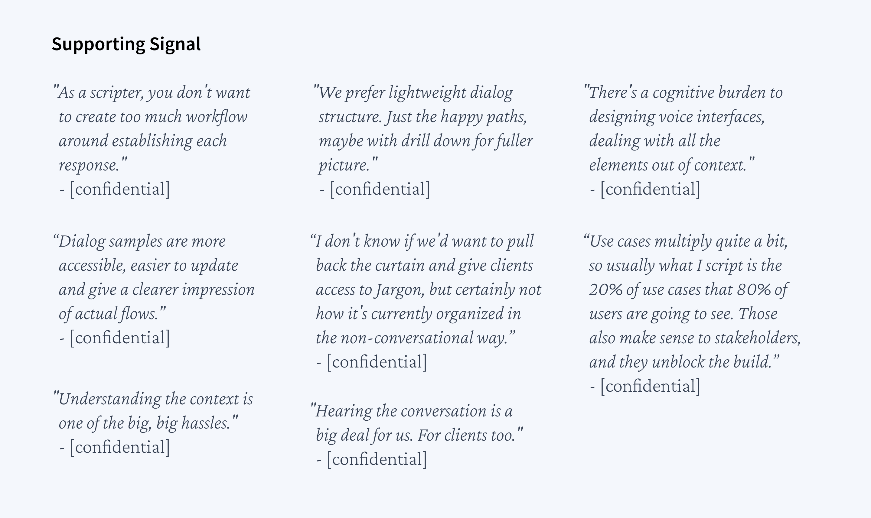
I made the case for addressing this need, using journey maps and quotes from the database of customer insights I maintained.
Supporting signal from customer interviews
I drove team alignment on feature definition and guiding principles (UX and product) for this new "Scenes" feature, before leading the design through review and improvement cycles with the team and customers, from low-fi concepts to a detailed prototype.
Demo video I created
After we built and released Scenes, I closely monitored user behavior in Fullstory, to look for intended behavior and traction.
When those fell short, I pushed for more rigorous testing with unbiased and representative participants (conversational designers). (This required significant effort to get the team to commit money to finding good participants, including conveying the limitations of ongoing practices such as evaluating with “friendlies,” piggy-backing on sales/onboarding calls, and watching Fullstory sessions that lack the why of users’ behavior.) I found participants through a combination of a screening survey posted in an online community, and direct outreach on LinkedIn.
I ran the user sessions, taking the opportunity to evaluate the user experience from the top of the funnel: from the website to signup to onboarding and the actual new feature.
I presented the key findings to the team, highlighting what we were already doing well, where the biggest challenges remained, illustrated with clips from the sessions, and led the conversation around next steps.
It turned out our recent pivot from voice to chat (a visual medium) had created new user expectations, and the design was now falling short:
After discussing this with the team and considering options, we chose to hide Scenes for now, knowing that - as is - it was adding more distraction than value to our product. It was a tough call to make, but I knew it was the right one and that we would return to it at a later time.
In the end, we weren’t able to return to Scenes before the money ran out. I do think we were getting very close to solving a hairy problem that the industry as a whole had long struggled with.