American Family sells car insurance thorugh multiple channels, but it’s direct online sales had been stuck at low conversion. They were looking to create a high-converting flow and get on the path to becoming a digital sales leader.
I was team lead, strategist, UX designer and researcher on this project. I also directed a visual designer and a second researcher (to allow us to run more sessions in shorter time).
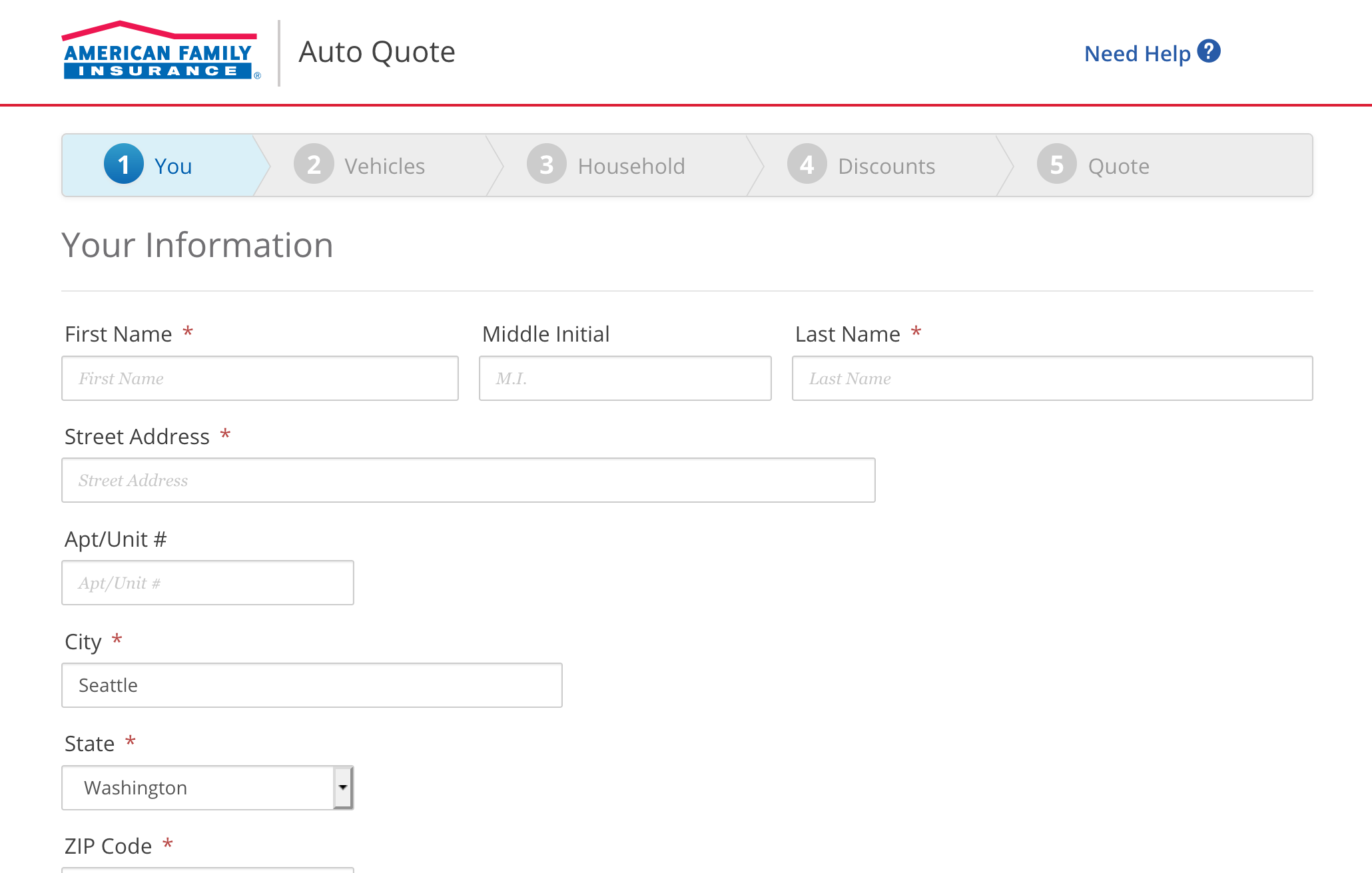
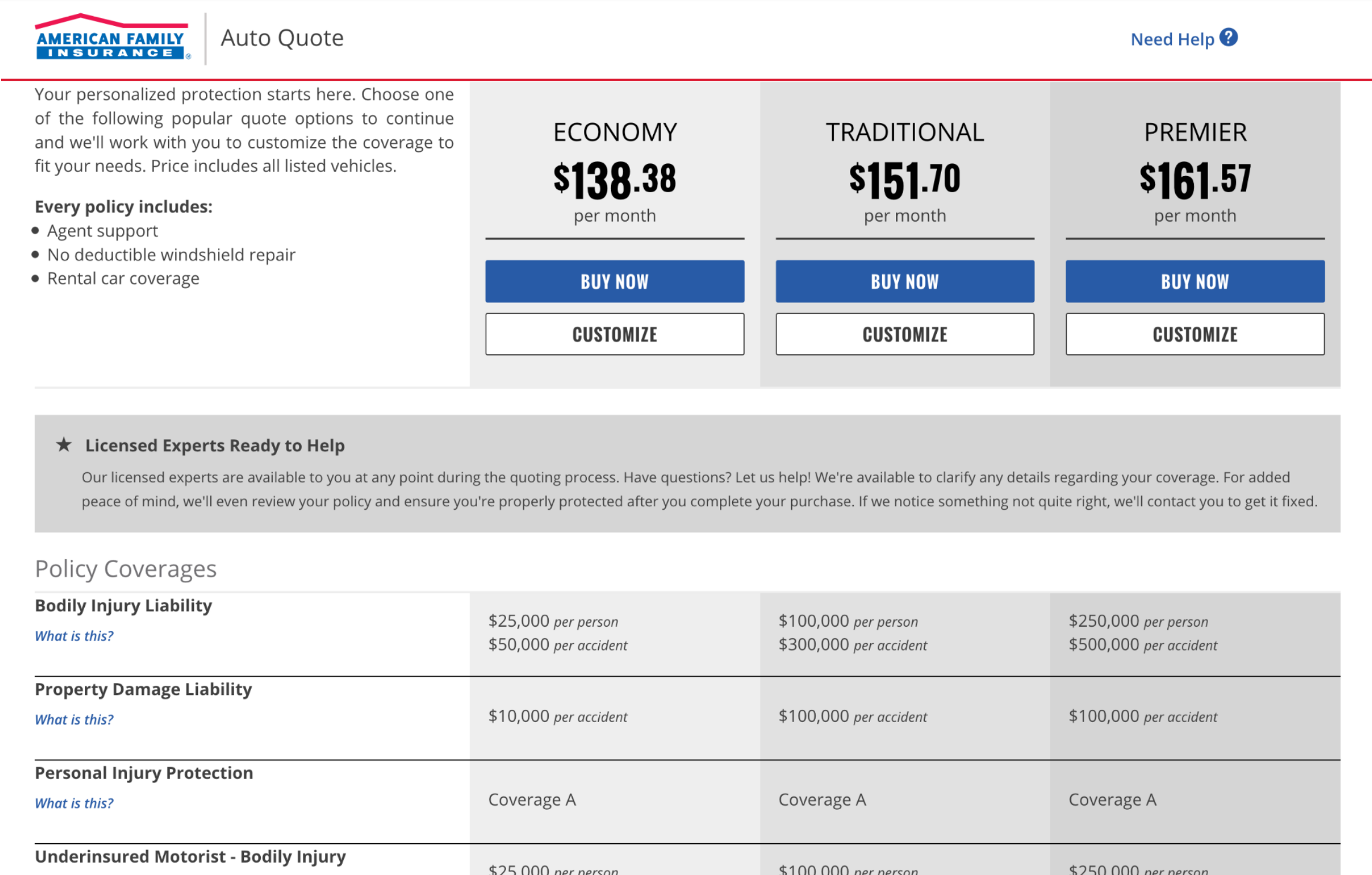
Before: Endless form-filling and a confusing/overwhelming quote.
To overcome organizational inertia, we wanted to inspire with fresh ideas backed by user evidence. For this we went deep on research and wide on design.
Innovation happens at the intersection of creativity and deep insight into needs, so I first immersed myself in the space:
We had wealth of data with many clear patterns emerging, including people's
To help the team make sense of all this data and to guide our thinking, I created several models and UX/product design targets:
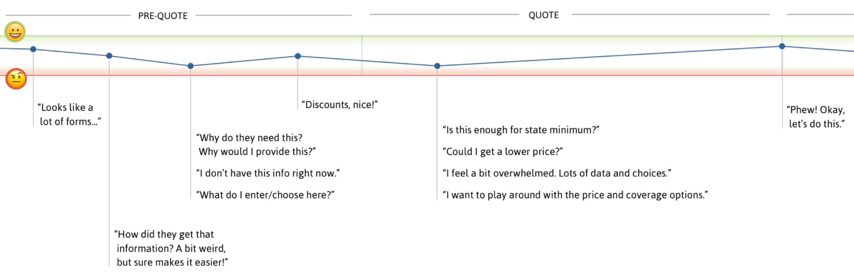
Journey map: Friction on the road to car insurance
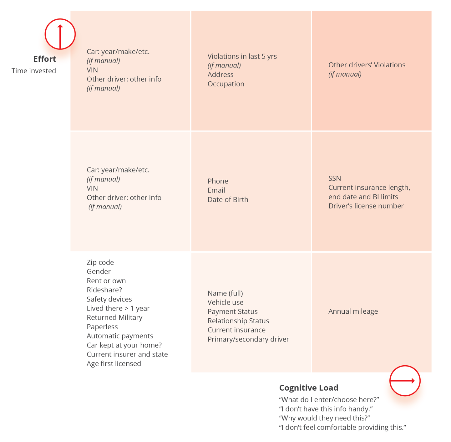
Risk matrix: Inputs commonly gathered for a quote, with associated risk of causing abandonment.
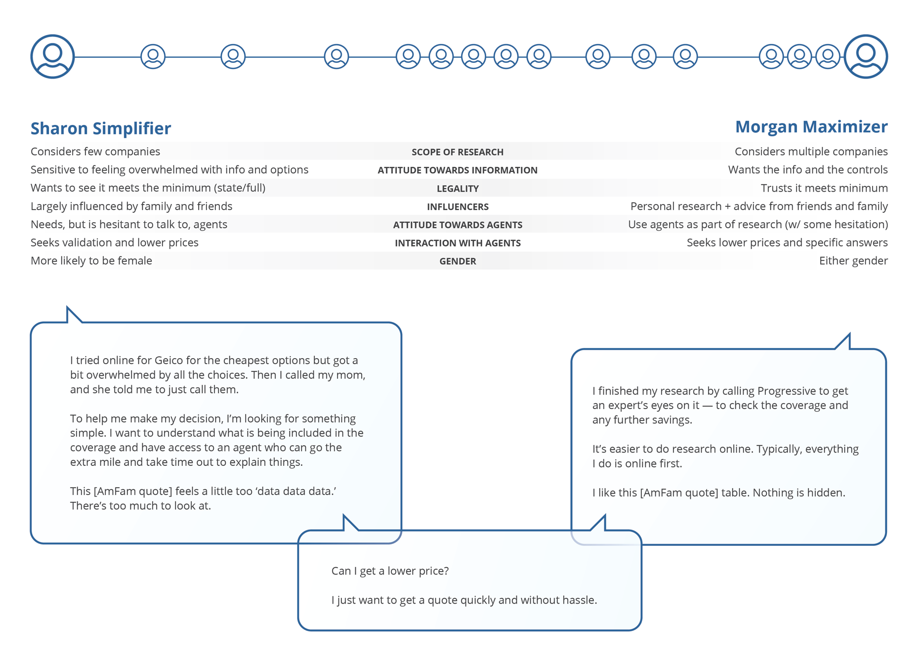
Behavioral spectrum: Attitudes and behaviors in car insurance research. Two profiles at the edges span the range of attitudes and behaviors observed in the 16 participants.
I reviewed these findings with the client team, incorporating their additional insights and eliciting priorities.
I then turned these insights and priorities into actionable UX/product/design targets, making sure that each could be traced back to user evidence from discovery.
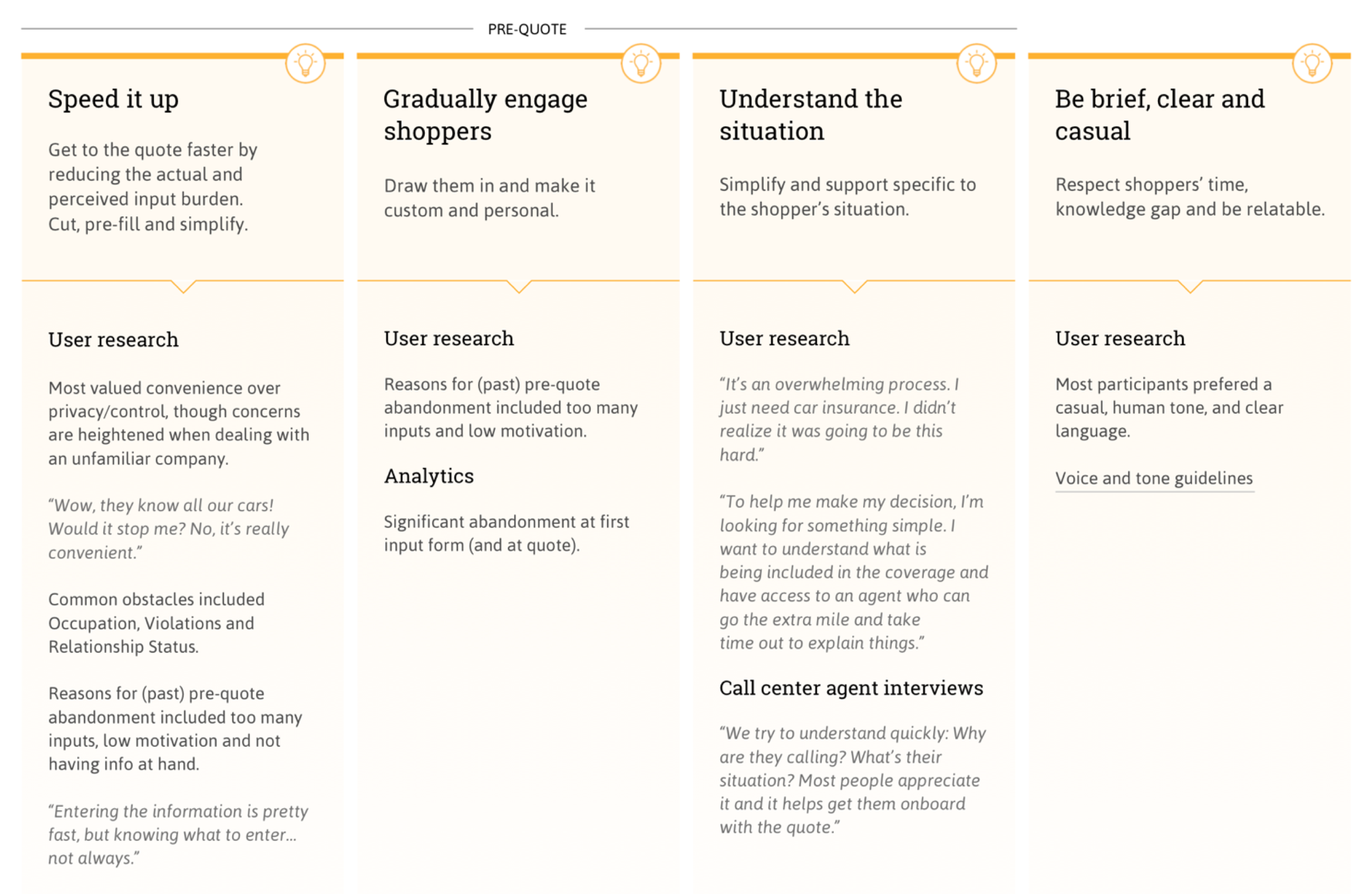
Design targets with supporting evidence
I led the team in a “How might we…” ideation session to generate ideas around key design targets and pain points, then used “dot voting” to identify the ideas worth pursuing further.
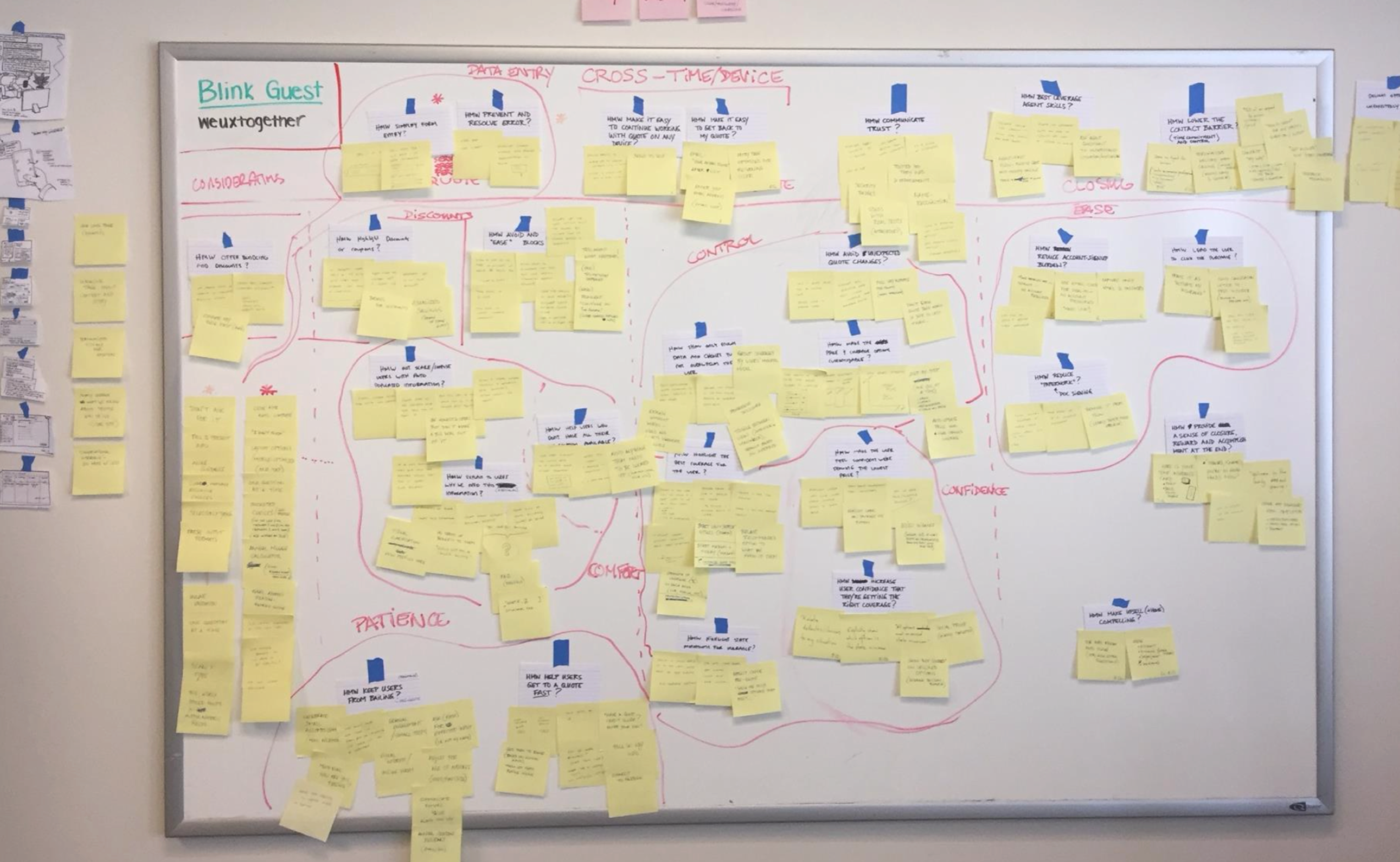
Generating ideas around user pain points.
I then designed various concepts around the most promising ideas:
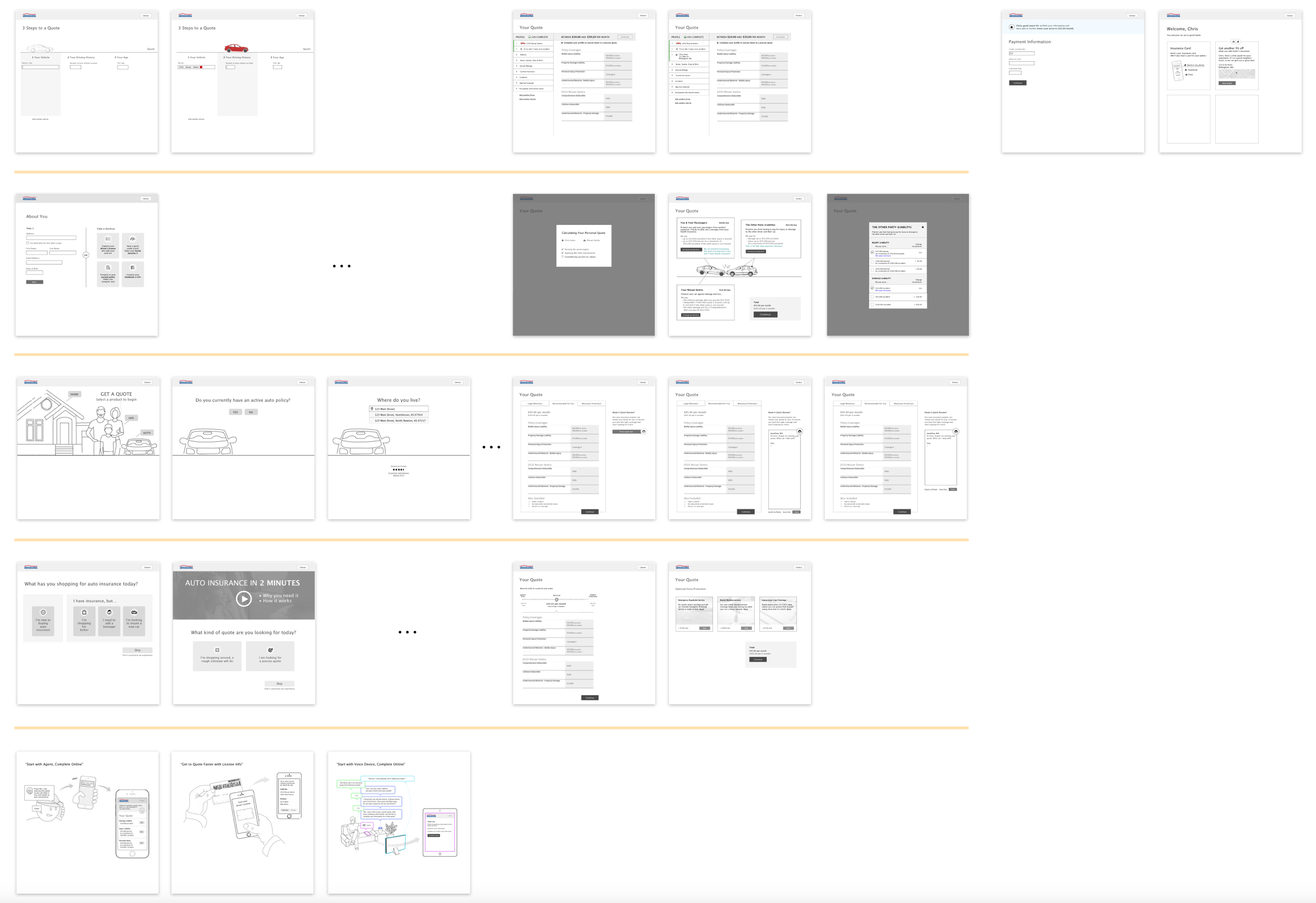
Low-fi concepts for user testing, focused on the pre-quote and quote phases.
I gathered user feedback on these using lightweight clickthrough prototypes (Sketch + InVision), to identify which ideas resonate with users and why.
We now had a good idea of the most promising ideas, which we merged into two final high-fidelity end-to-end concepts for the client to carry forward.
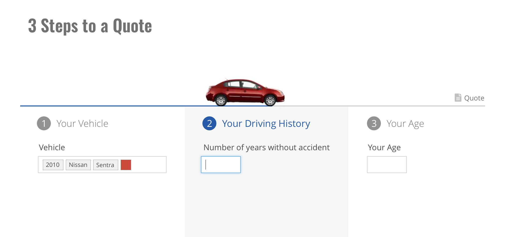
Part of final concept A, focused on minimal initial inputs to quickly generate a quote range that can then be further narrowed down, one question at a time.
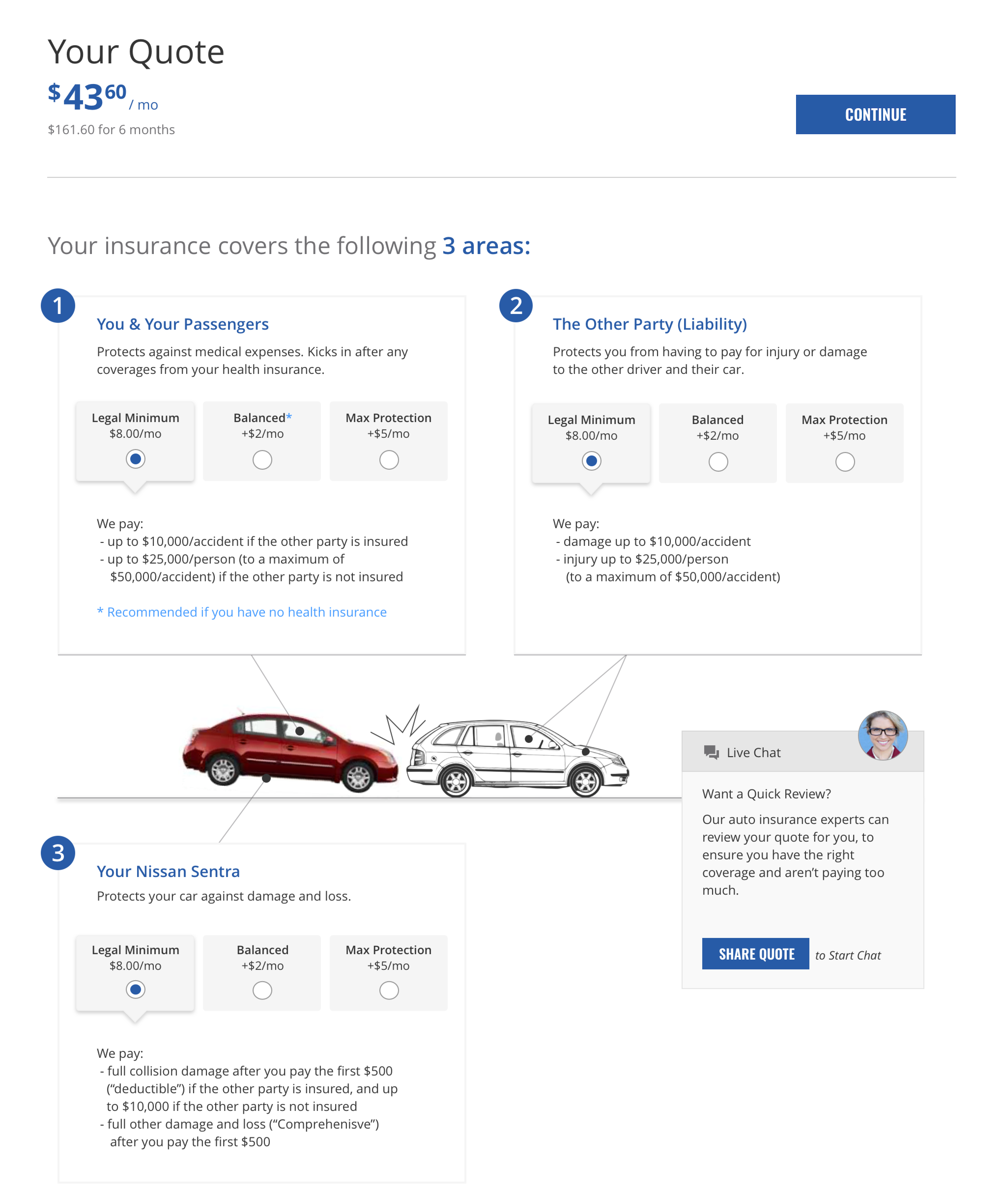
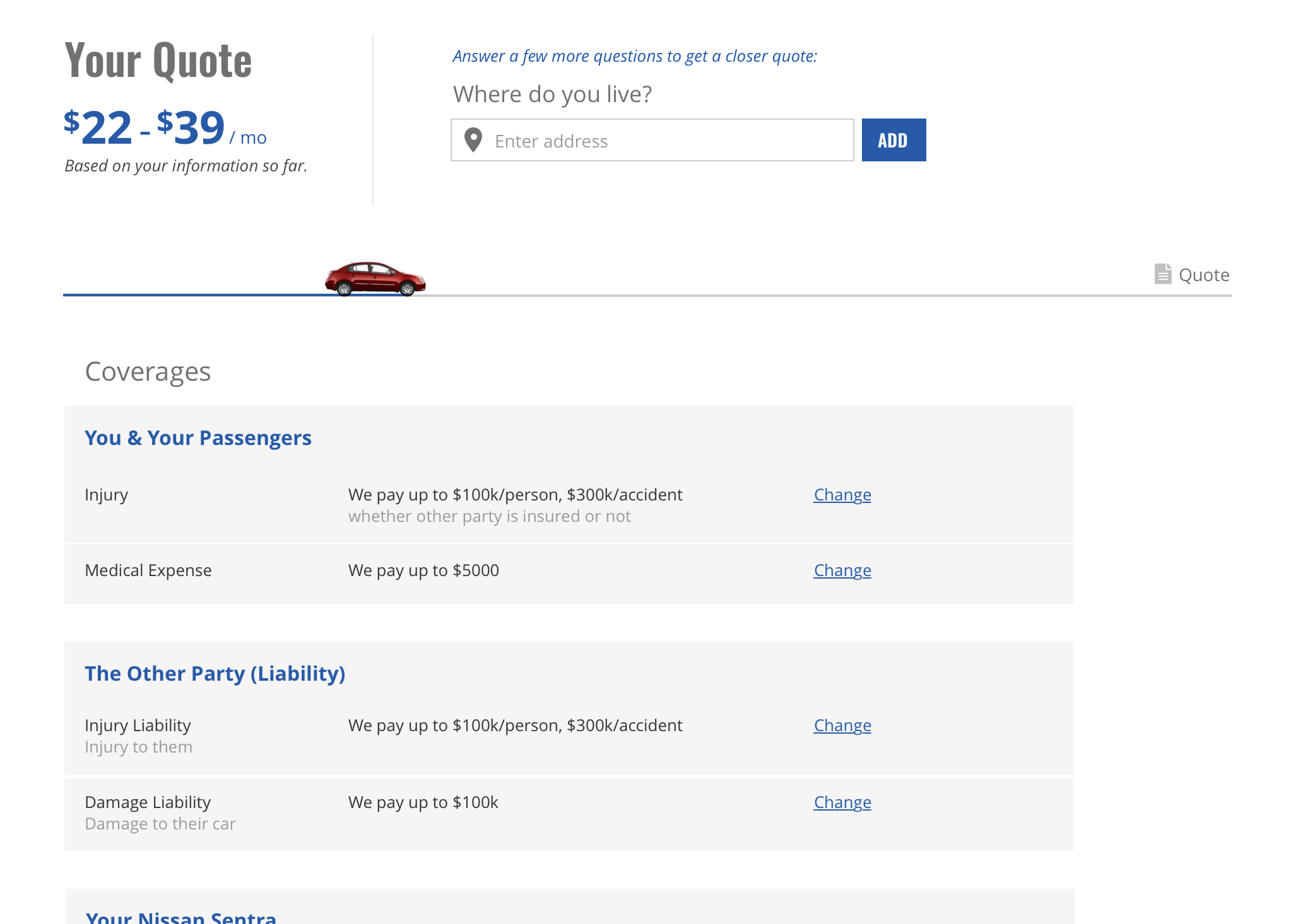
Part of concept B, focused on: a clear breakdown of areas of coverage, strong defaults with easy and transparent adjustment-if-desired, and easy sharing with a pro (agent) for review and questions.
Throughout, I made the rationale explicit, tracing each design decision back to design targets and user evidence. This gave the client confidence in the user demand behind these concepts, and allowed for informed decisions when subsequently going deeper on feasibility/viability tradeoffs.
An innovative vision for getting car insurance, thoroughly backed by user evidence.
Note: unlike most of my projects, this one focused purely on creating a (much-needed) user-centered vision piece rather than a product design blueprint: thoroughly vetted for user needs, but without the usual discussions and tradeoffs around business and technology needs.