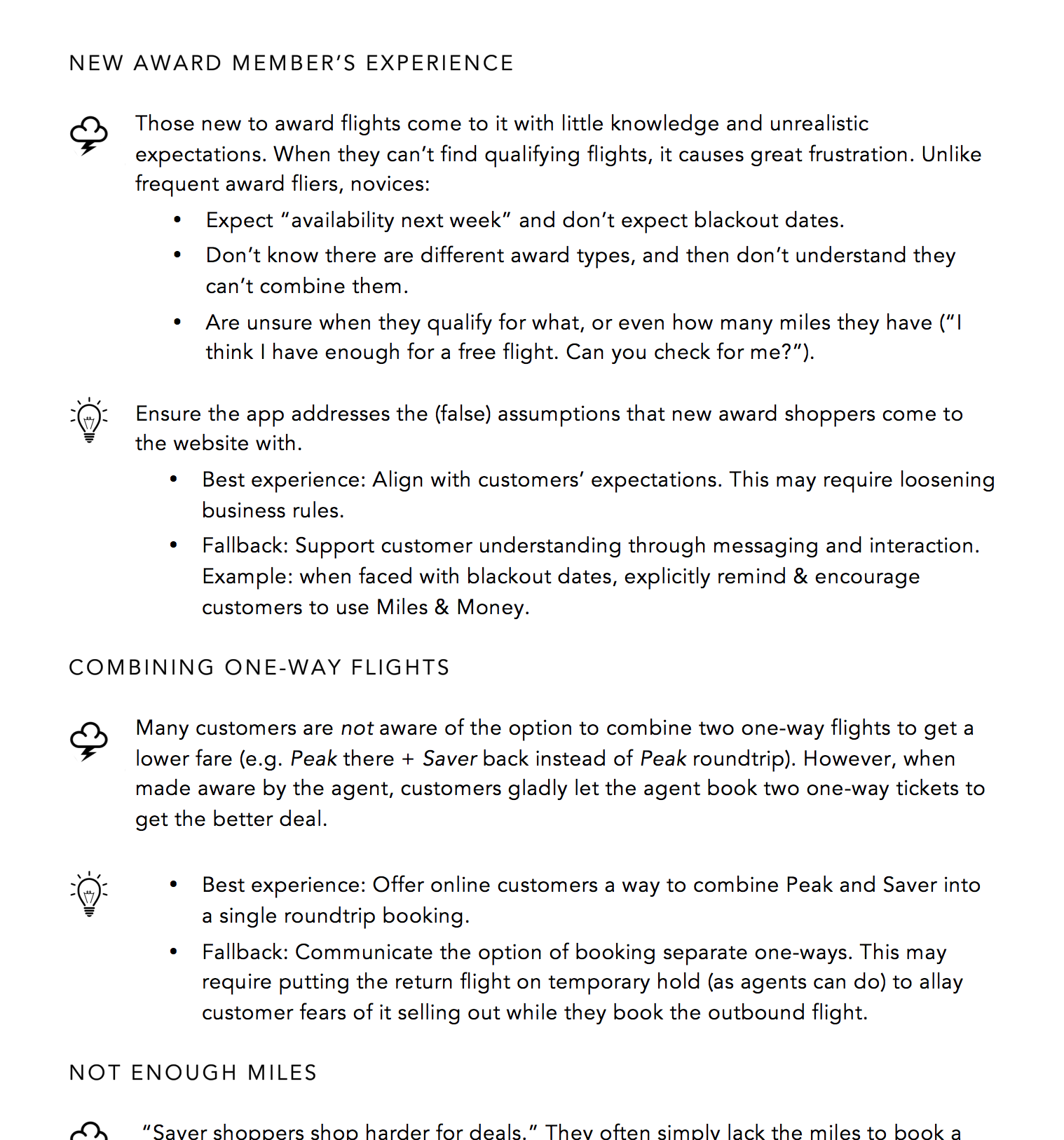
Alaska Airlines' mileage plan award flights were a headache for customers and the company alike:
I led the UX design of the Award Finder Calendar as part of the Alaska Airlines team, working closely with business and development. The main challenge was to make it a lot easier for people to find acceptable award flights and use their miles.
I knew this was going to be a challenge: an app that supports users in decision-making, built on complex business rules and legacy technology. So I first made sure I got a solid grasp on the problem space, including user, business and technology needs.
I expanded the team's understanding of the problem and solution spaces as follows:
I interviewed reservations agents to gain a better understanding of customer needs & knowledge. This step uncovered many opportunities, including a mismatch between user needs and business rules.
Findings and UX implications from interviews with customer service agents.
I considered a variety of UX patterns in award flight shopping, including those from a scan of competitive airlines. I visualized the essence of each pattern along with its pros and cons.
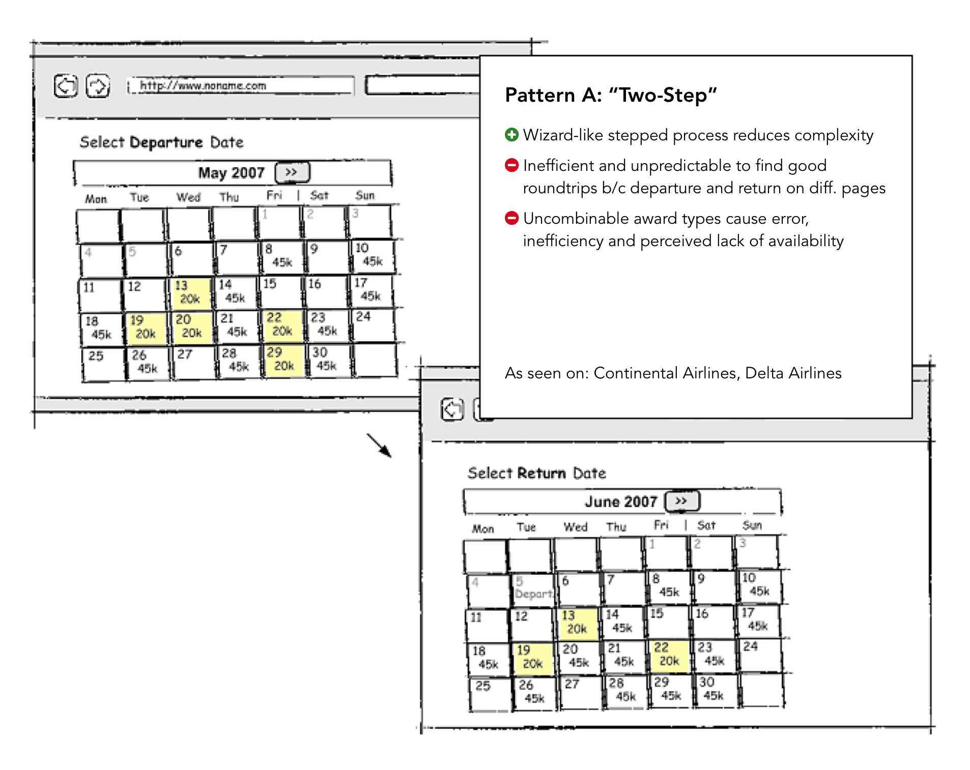
Two-Step, one of the UX patterns I considered. Other patterns included Side-by-Side, All-in-One and By Duration.
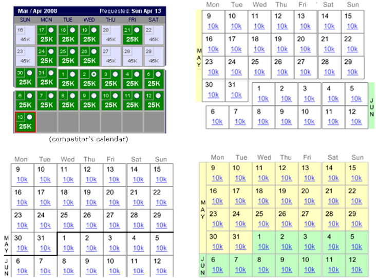
After selecting the most promising patterns, I validated customer performance & preference with two competitor sites that employed those patterns. This identified the strongest pattern as well as opportunities for further improvement. (Participants at the Alaska Lounge at Seatac - having drinks while waiting for their flights - were very honest in their feedback, if a bit hard to keep on topic.)
A major outcome of this effort was the simplification of the underlying business rules, which I was able to accomplish by gathering compelling user evidence and partnering with product management. It opened the door to designing a vastly better customer experience.
Next I performed iterative cycles of design-review-adjustment, with customers, developers and business reps, using a combination of scenarios, sketches and interactive prototype.
One challenge involved continuous (scrolling) calendars. While these align more closely with people's mental models than per-month views (especially when people need to consider multiple dates, like departure and return) testing had shown that people struggled with how a competitior had implemented the visual separation between months, negating the conceptual benefit. Here I explore ways remove that downside:
Exploration of better ways to visually separate month boundaries.(Nowadays, Apple Calendar has decent implementation of a scrolling calendar.)
I eventually abandoned the idea of scrolling calendars after I watched people struggle with a prototype that had two scrolling calendars side-by-side (outbound and return).
The next iteration of the prototype solved the previous challenge, but revealed another: people struggled to understand that the two calendars shown side-by-side were for different flights (outbound and return) rather than just two months make the initial selection from. Here I explore somewhat visually disruptive ways to better communicate the concept.
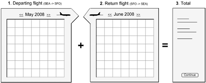
Exploration of ways to communicate that the two calendars represent outbound and return flights.
A useful, usable and appealing web app.
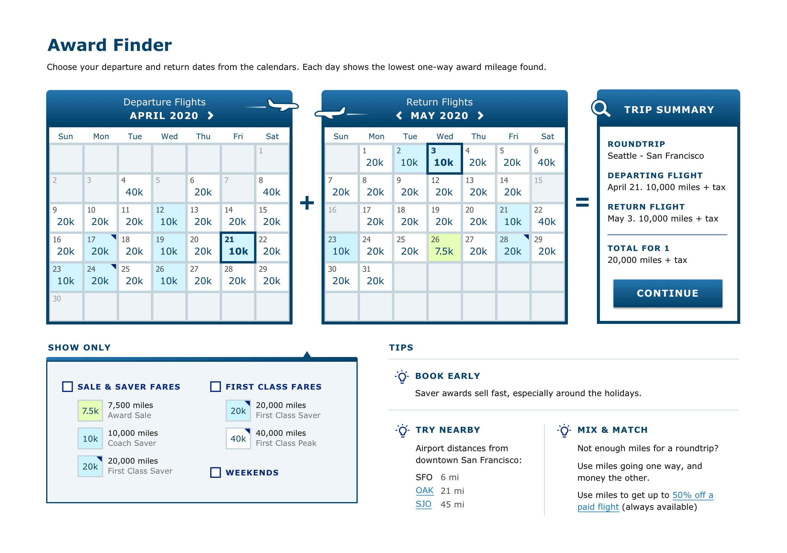
The final design
Note: At the time, I created the UX/interaction design, but worked with a UI/visual designer on the aesthetics. Looking back, I feel we didn't push it hard enough on the old UI/visual design, so I recently redesigned the look myself as an exercise (shown here).